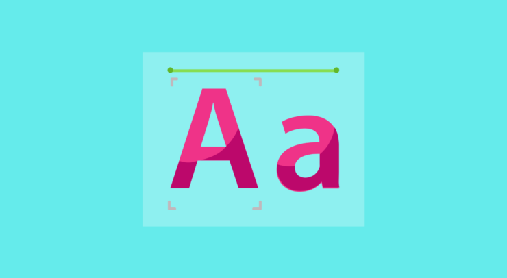
Typography is an effective tool to make attractive and dynamic designs. It is essential to produce banners that have a lasting impression on the audience. Fonts are the voice when it comes to creating effective banners that convey words and feelings. They are more than simply a collection of letters.
Typography is more than just selecting attractive or aesthetic fonts. It is important to target the appropriate audience when communicating. You should pick fonts that go with your overall design and the aesthetics of the banner to attract your audience. However, decorating your fonts can be hectic, find here printing services to effectively design your banner for both business and personal uses.
Factors to Consider When Choosing Fonts For Effective Banners

When choosing a font for banners, several elements are very important. Legibility and readability come first and are of utmost importance. Even if a font is aesthetically pleasing, it won’t be successful if it’s difficult to read. Here are a few factors that must be followed when selecting fonts for effective banners .
1. Understanding the Psychology of Fonts
Fonts have a significant psychological influence on the audience other than just communicating text. Different font designs represent different feelings and impressions. For instance, fonts that are big and chunky communicate confidence and power, while fonts that are beautiful and script-like convey refinement and charm.
The secret is to match the font’s intended message and the targeted audience. Using fun and creative fonts to advertise a children’s event may be suitable. On the other hand, a formal corporate function can call for clean, formal fonts. By comprehending the psychology of fonts, you can design banners that subconsciously appeal to your audience.
2. Prioritizing Readability and Legibility

Although experimenting with unusual fonts may be alluring, fluency and readability should never be neglected to ensure effective branding. Only when a banner’s message is clear at a glance, it be effective and easy to understand. Overly complex fonts might confuse readers and discourage them from interacting with the text.
Make sure the fonts you choose have distinct and readable designs. Due to their simplicity and readability, particularly from a distance, sans-serif fonts like Arial and Helvetica are popular options for banners. Consider the font size carefully as well to guarantee that it can be seen from a variety of distances when the banner is shown.
3. Maintaining Consistency in Fonts
When creating banners for a company or an occasion, consistency is essential. Too many fonts in one banner might give it a disorganised and unprofessional look. Limit your use of fonts to no more than two or three: one for the main headline, one for the subheadings, and, if required, a third for the body of the text.
It is critical to use fonts that complement one another for a design to be coherent and pleasing to the eye. By using relevant information using contrasting fonts, the reader’s attention may be led across the banner in a planned and interesting way.
4. Balancing Creativity and Simplicity

Your banners can be uninspiring and unappealing even while readability and uniformity are maintained. The trick to creating compelling banners is striking the ideal mix between creativity and simplicity. You should also choose a font that complements the identity of your company and the tastes of your target market.
In order to ensure readability, headlines should be written in a font that is visually stunning and paired with a more basic font for supporting content. Making an impactful statement while keeping it simple will prevent you from overwhelming the audience.
5. Playing with Font Hierarchy
Font hierarchy is the tactful use of font styles and sizes to draw attention to various parts of the banner. The audience’s attention is directed by a properly executed font hierarchy, which also makes it easy for them to traverse the material. You may choose a font for banners with more knowledge if you understand the psychology involved.
Larger and bolder fonts naturally pull the eye to the headline and quickly communicate the main idea. To provide visual contrast and retain readability, subheadings and supporting text should be somewhat smaller. Different font styles and colour schemes might be used to emphasise bullet points, callouts, or essential information.
6. Considering Brand Identity
The fonts used in banners for companies and organisations should complement their brand identity. Font uniformity across marketing materials improves consumer memory and brand identification. If the company has a distinctive font, including it in the banner design might enhance brand recognition.
If the brand doesn’t already have a particular font, though, think about choosing one that captures its essence and core beliefs. For instance, a contemporary and stylish business can use sleek, futuristic fonts, whilst a vintage-inspired brand might favour exquisite, traditional options.
7. Select Fonts Depending On The Contents

The selection of appropriate fonts also varies depending on the contents of the banner. The selected font must aim at highlighting the purpose of the content. The best way to select an appropriate design is to consider the genre and target audience. It can help in attracting their attention and will help in creating a significant impression on them.
Make sure the fonts are expressive and the audience is able to connect with the content of the banner. Sans serif fonts are often selected to resemble simplicity, clarity, and functionality.
The Bottom-line
In the process of designing a banner, typography is a potent instrument that can be used to elicit feelings from the audience, alter their views, and draw them in. Understanding the factors can help you choose fonts that are successful and effective for banners. Do not forget that the choice of fonts can make the difference between a banner that is quickly forgotten and one with a lasting impression.
In order to elevate your banner designs, let your font selections speak for themselves. To continuously enhance your banner designs and maximise their efficiency in spreading your thoughts to the globe, keep trying new things, testing different combinations, and asking for feedback.